Merging three portals into one:
Designing a central management portal
My role
I worked on my own for the V1 MVP. I started by understanding three complex, highly technical web portals to identify the most useful functionality from each portal. Collaborating closely with stakeholders across time zones was vital throughout. Ideating and prototyping solutions with accessibility conformance in mind came later on, as well as validating MVP design decisions with usability testing.
Key skills
• UI/UX design
• Usability testing
• Accessibility
• Site mapping
• Remote collaboration
• Design thinking
🌟 Outcomes and impact
• Designed a unified portal design to replace three fragmented legacy systems
• Improved accessibility through promoting the use of keyboard navigation and focus states
• Created a modular design system to ensure consistency across features and dev teams
• Ran usability testing to gain insights for iterative refinements
• Partnered with product managers to prioritise changes and logged updates as Jira/Confluence items
Blancco Management Portal today (light mode)
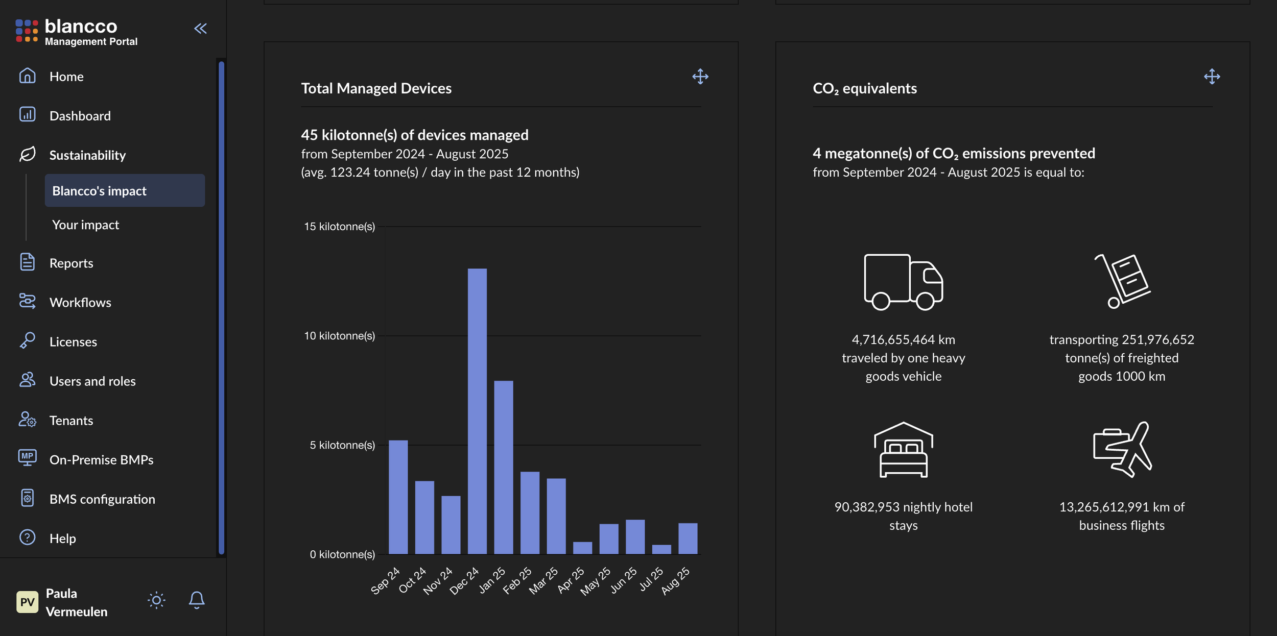
Blancco Management Portal (dark mode)
🧩 The problem to solve
Before this project, Blancco had on three separate, but fairly similar portals:
• Each was built independently in different countries with different goals, features, and UI styles
• Products with high technical complexity and unintuitive UX were a challenge to use
• The customers faced a fragmented experience going from one product to the next for specific functionality
• Dev teams duplicated work, creating inefficiencies and inconsistencies by working in silos on different products
🧠 Process
Step 1: Research and audits
To get to grips with the products, I conducted product audits, read manuals, used the products and created site maps to understand the IA. I worked on the design system in parallel and therefore kept visual and interaction design in mind throughout. I also interviewed stakeholders such as product managers and support personnel, to understand core features and priorities. This also involved identifying any feature overlaps and getting clarity on the business strategy.
Step 2: Defining requirements
After I developed a clearer picture of what to keep, discard or redesign, I clarified the requirements with stakeholders. We prioritised the key functionality based on common customer problems to solve. To get a high-level idea of the product, I created an IA map to ensure that all the required content would be included.
Step 3: Ideating, wireframing and defining a visual language
Sketching was the fastest way to work when it came to exploring layouts and creating wireframes. This also helped to plan out the navigational structures (menu items, utility links, etc.).
After the high-level details were finalised, I started developing a visual style for high-fidelity level prototyping, which would later form the design system (referencing Brad Frost’s Atomic Design concept).
Some of the V1 design system documentation for Blancco Management Portal
Step 4: Prototyping
After creating an initial idea of the final product, I created high-fidelity prototypes feature by feature. The next step was to layer on accessibility details (keyboard navigation, focus states, dark mode) and ensure that developers were using the design system consistently. Ensuring that components are treated as reusable patterns in the development teams seems to be an ongoing mission.
The outcome of this step was to create a functional MVP suitable for usability testing.
Step 5: Usability testing
Comprehensive testing was done after the MVP was implemented (covering 10 tasks).
Steps taken to plan for usability testing
Methodology:
• 10 participants unfamiliar with the product
• Remote setup with moderated onboarding + unmoderated tasks
• Tested across Windows, Mac, Ubuntu with various browsers (Safari, Chrome, Firefox)
• Tasks included login, search & reports, workflows, dark mode, and language switching
• Measured outcomes: direct success, indirect success, failure, unvalidated
“Users generally liked the new interface and dark mode. They took a little while to adjust to the new website, but successfully completed tasks overall.”
Key issues:
• Columns were not spread out and table columns were not sortable
• Tables loaded slowly
• Side nav could be more intuitive
All issues were prioritised according to a scoring system and then logged in Jira. This testing process helped to create a clear roadmap for iterative improvements. It also validated the MVP and set a benchmark for future testing.
Read more about the product.
💭 On reflection
The Blancco Management Portal is used by an increasing number of customers today. The outcome is a streamlined experience that forms a foundation for other product interactions e.g., using Blancco Drive Eraser.
Looking back, there were valuable lessons I learnt through this intimidating project:
Applying design thinking is helpful for structuring this complex projects, but is not a linear process
Accessibility is really important and keyboard accessibility affects not only those with disabilities but “power users” too
A design system is most beneficial if it’s well-evangelised and used by developers
Prioritisation of usability issues are really helpful for keeping the bigger picture in mind
Even though testing early and often is almost always best, running usability testing after implementation meant we could test more of the product at once and identify browser-related usability issues


