
V1.0 design system for a B2B SaaS ecosystem
My role
I took the initiative to create consistency of the user experience across a range of interdependent B2B SaaS products.
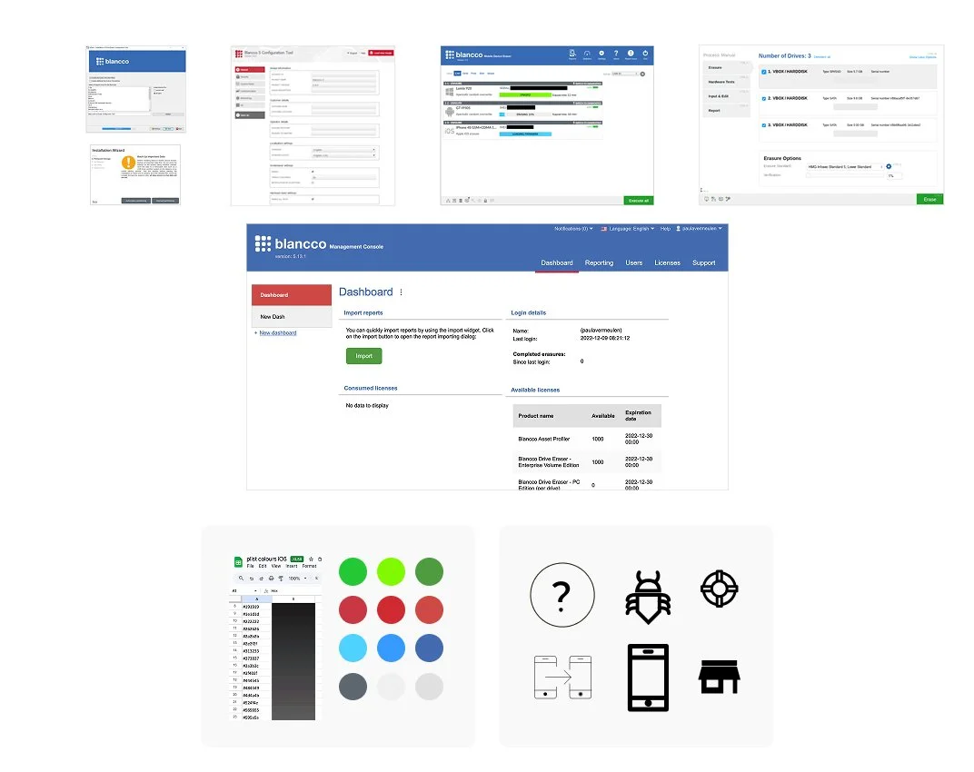
I created and implemented the first design system for Blancco’s cross-platform products (web, desktop, mobile).
Key skills used
• Systems thinking
• Visual design
• Interaction design
• Cross-platform design
• Accessibility
• Design and dev collaboration
⚠️ The problem to solve
There was official no unified design language, and each dev team had its own approach to designing the UI and UX.
As a result, there were several UI/UX misalignments between products, exacerbated by siloed dev teams. For example, there were duplicated and differently styled components, with no single source of truth and mounting design debt.
As the company grew and scaled, there was an increasing need to create a consistent user experience across its web, mobile (iOS and Android), and desktop SaaS products.
🎉 Outcome and impact
• Delivered design systems for each platform (12+ products) which were used by the design and engineering teams
• Sped up design-dev handover with shared component libraries
• Improved UI/UX quality delivery for 6 global teams with less ambiguity in the development and QA stages
• Enabled faster onboarding for new designers and made things easier for existing designers

The outcome: a more unified experience across platforms
The problem: Differently styled UI’s (one dev team was using 64 variants of grey)
📝 My process
Step 1: Conducted an audit
An audit of the visual assets, styles and components used in the products was a solid starting point. I also aimed to get an understanding of any technical limitations, overlaps and inconsistencies between products as part of this research.
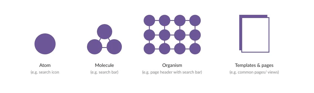
Inspired by Brad Frost, I wanted to create a modular system
Step 2: Focused on foundations and common denominators
I created a foundational colour palette and extended it for data visualisation and dark mode (with rebranding happening at the moment, this will be updated towards the end of 2025).
Next, I focused on creating typographic scales, spacing, grids, and elevation. Spacing guidance was platform-specific and sometimes OS-specific as well, e.g., according to best practices, tap targets should be 44pt × 44pt for iOS and 48dp × 44dp for Android with 8dp multiples for padding.
I also designed icon sets and helped my team to create consistent JSON-based animations optimised for mobile use (using After Effects and Bodymovin), which were all documented.

Basic colours used for all web, desktop and mobile products

Typography is somewhat platform-dependent, but unified through colour and typeface

Spacing is based on a 4px grid system
Step 3: Components and patterns
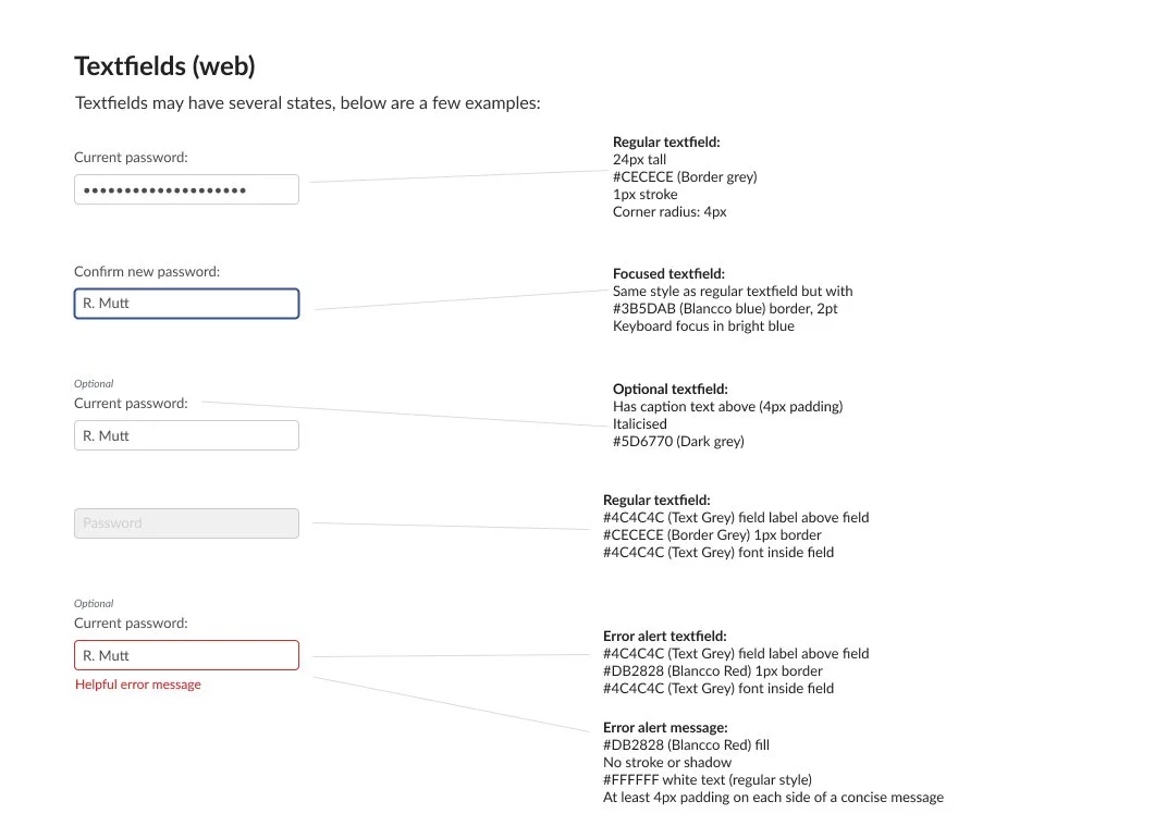
I defined sets of unified reusable interactive components (states: hover, focus, disabled, etc.) and documented standard patterns.
To do this effectively, I worked closely with the tech teams in the various countries. I aimed to understand platform constraints and reach solutions that worked for both design and development teams. Topics covered included: programming frameworks (e.g. Kotlin, Swift, Qt, React), native VS custom components, naming conventions and component library creation strategies (custom component libraries, Figma, Storybook).
Accessibility was included in the design system and embedded into design and dev practices (colour contrast, alt text and keyboard focus etc.).
A little example of icons used in one desktop product

A blue stroke is used to highlight items with focus for keyboard navigation

A sample of guidance around the styling of buttons and text links
Basic guidance around states for buttons
🍟 My takeaways
Through this project I learnt a lot about collaboration, technical challenges and limitations.
But, here’s what made it successful:
1. Detailed product audits and constant design system maintenance
2. Collaboration with dev teams to ensure alignment across platforms
3. Educating others on the benefits of design systems and applying systems thinking
4. Involving designers to create a shared sense of ownership
The design systems are still in use today, reducing confusion around UI details and increasing consistency. This work created a foundation for user interface design as well as the user experience.
Beyond that, this project also built bridges between teams and led to a culture of collaboration and an increased interest in UX throughout the organisation.